You want to up your Data game? Here are the techs on the rise
The purpose of this analysis is to get some insights from 20 036 responses that were given to the 2020 Kaggle survey.
Main focus is to understand at high level what “areas” and technologies are most common among the respondents down to a set of specific roles.
Summary
- Cloud platforms are and will continue to be the key tech focus (ie. Amazon currently actively used by 25% of the focus group and expected rise by up to 45% within two years).
- A redistribution of the skills’ weight in the near future is to be expected from database to cloud (Compute Services and Machine Learning Services).
- Individual cloud services - though used and on the rise - will not know such an adoption as the platform itself.
- Amazon, Google and Microsoft are the names of the cloud game and Amazon is in the lead.
- Python is the “lingua franca” for data science. Even more so if we look at the next student cohort. Though R is still extensively used when looking at people working in “decision science”.
Glossary
Technology/Tech : refers to a specific technology that is used in the realm of data science. It could be for example a piece of software like “Tableau” or a cloud service like “Azure ML studio”.
Area : in the analysis area will be a category that groups a number of technology. Here are a couple examples:
- BI for business intelligence tech (Tableau, Power BI, Alteryx)
- DB for Databases technology (MySQL, MongoDB…)
specific roles/Focus Group :
Data source & Analysis purpose
The data source of the analysis was kindly provided by Kaggle can be downloaded from the following location.
I believe that the results can used in couple of ways :
- As we enter 2021 🍾 - with new year resolutions might come the desire to get familiar with some new technologies 💪.
With this in mind I see two approaches :- Define an area/tech that is quite common but you do not currently have. You might want to get exposure to make sure you tick all boxes in your next career step.
- If you like to play the odds,define an area/tech that is not that common but foreseen with high growth so that you can be the rare catch when it breaks loose.
- You have been assigned a new project and need to down select the right tech for it. It might useful to get a quick understanding on how large is the pool of talent out there to build on it.
# Load the necessary libraries

library(tidyverse)
library(readr)
library(tidytext)
library(png)
library(patchwork)
library(ggtext)
library(magick)
library(here)
# Set theme - though not yet used in this current version
theme_custom <- theme_light()
theme_custom <- theme_update(plot.title.position = "plot",
plot.caption.position = "plot"
)
theme_set(theme_custom)
# Set Scales
gradient_cust_scale <- scale_fill_gradient(low = "#1C7FA6",
high = "grey44")
fill_cust_scale <- scale_fill_manual(values=c("grey44","#1C7FA6","#22CCF2","#3F9BBF","#F2F2F2"))# Load the sources
survey_raw<- read_csv(here("static","Kaggle_post","00_Data","kaggle_survey_2020_responses.csv"))
top_tech_rename <- readxl::read_xls(here("static","Kaggle_post","00_Data","data_top_all_tech.xls"))
profile_focus <- c("Business Analyst","Data Analyst","Data Engineer","Data Scientist")# Load functions
source(here("static","Kaggle_post","00_Functions","Graphing_functions.R"))# Do a first prep of the data to extract respondents "facts"
survey_prepped <- survey_raw %>%
mutate(participant_id=row_number())%>%
filter(participant_id!=1)
surveyed <- survey_prepped %>%
select(participant_id,Q1:Q6) %>%
rename(Age=Q1,
Gender=Q2,
Country=Q3,
Education=Q4,
Role=Q5,
Tenancy=Q6)What are the roles of the respondents?
# Data prep
surveyed_role <- surveyed %>%
  count(Role,sort = TRUE) %>%
  mutate(pct=scales::percent(n/sum(n),accuracy = 1),
         top_cat=if_else(row_number()>3,"N","Y"))


surveyed_role %>%
  filter(!is.na(Role)) %>%
  mutate(Role=fct_reorder(Role,n)) %>%

#Plotting
  ggplot(aes(n,Role,fill=top_cat))+

  #Geoms
  geom_col()+
  geom_text(aes(label=pct, hjust = 1.2), color = "white")+
  geom_text(aes(x = 3000, y = 4.5,
                label = "Top 3 occupations represent 50% of all respondents"),
            stat = "unique",
            color="#1C7FA6")+

  #Arrows
  geom_curve(aes(x =3000 , y = 5, xend = 1200, yend = 11),
             size = 1, color = "#22CCF2",
             curvature = -0.5, angle = 45,
             arrow = arrow(length = unit(0.07, "npc")))+
  geom_curve(aes(x =3000 , y = 5, xend = 2200, yend = 12),
             size = 1, color = "#22CCF2",
             curvature = -0.4, angle = 30,
             arrow = arrow(length = unit(0.07, "npc")))+
  geom_curve(aes(x =3000 , y = 5, xend = 4500, yend = 13),
             size = 1, color = "#22CCF2",
             curvature = 0.4, angle = 60,
             arrow = arrow(length = unit(0.07, "npc")))+

  #Labs and Scales
  labs(title = "Current occupation of the survey respondents ",
       y="",
       x="Number of respondents")+
  fill_cust_scale+


  # Theme
  theme(legend.position = "none",
        plot.title.position = "plot",
        plot.caption.position = "plot",
        plot.title = element_text(face = "bold",
                                  margin = margin(10, 0, 10, 0),
                                  size = 14,
                                  color="#1C7FA6"),
  # Not to add to all plots
        panel.grid.minor.y=element_blank(),
        panel.grid.major.y=element_blank(),
        panel.grid.minor.x=element_blank())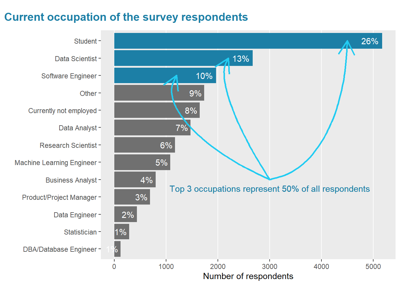
Before diving straight in the technologies used, I wanted to get a feel for the occupation of the surveyed population.
As per above graph, the top 3 roles represent about 50 % of the respondents.
With 26% the students represent a large part of the population.
The goal of my analysis is really to get a grip on the type of skills that are quite common in the respondents. And to be precise I would really like to understand selfishly the skills out there for person with a role similar to mine.
With this in mind, I will mostly focus the rest my analysis on the following roles :
- Data Scientist
- Data Analyst
- Business Analyst
- Data Engineer
This said, I will nevertheless for the next point of the analysis keep in consideration the student, to highlight when focusing one one specific element (data language used), the disparity that exits.
The never ending debate : Python vs R.
For those who have been reading often about data science or starting into the field, a question that always come up is “Should I pick R or Python?”.
Quite some articles have been published on the subject :
python <- "#ebbd26"
both  <-  "grey44"
R <- "#1f65b8"


# Data Prep _ All languages
languages <- survey_prepped %>%
  select(participant_id,contains("Q7_")) %>%
  filter(participant_id!=1) %>%
  pivot_longer(-participant_id,values_to="Language") %>%
  filter(!is.na(Language),
         Language!="NA",
         Language!="Other",
         Language!="None")


# Data Prep R & Python
rvspython_tbl <- languages %>%
  mutate(value=1) %>%
  select(-name) %>%
  pivot_wider(names_from = Language,values_from=value,values_fill=0) %>%
  mutate(other_language=C+Javascript+MATLAB+Java+Bash+`C++`+Swift+Julia,
         other_language=if_else(other_language>1,1,0)) %>%
  select(participant_id:SQL,other_language)%>%
  # mutate(L1=case_when(Python==1 & R==1~"Python",
  #                     Python==1 & R==0~"Python",
  #                     Python==0 & R==1~"R",
  #                     TRUE~"else")) %>%
  # mutate(L2=case_when(Python==1 & R==1~"R",
  #                     Python==1 & R==0~"Python",
  #                     Python==0 & R==1~"R",
  #                     TRUE~"else")) %>%
  mutate(likert_category=case_when(Python==1 & R==1~"Both",
                                   Python==1 & R==0~"Python",
                                   Python==0 & R==1~"R",
                                   TRUE~"else"))


# Visualization R & Python
rvspython <- rvspython_tbl %>%
  select(participant_id, likert_category) %>%
  left_join(surveyed %>%
              select(participant_id, Role),
            by = "participant_id") %>%
  filter(Role %in% profile_focus | Role == "Student",
         likert_category != "else") %>%
  group_by(Role, likert_category) %>%
  summarise(count = n()) %>%
  ungroup() %>%
  mutate(likert_category = fct_relevel(likert_category, "Both", after =
                                         1)) %>%
  group_by(Role) %>%
  arrange(desc(likert_category)) %>%
  mutate(pct_value = count / sum(count),
         pct = if_else(pct_value>0.02,scales::percent(pct_value, accuracy = 1),""),
         label_x = cumsum(pct_value) - 0.5 * pct_value,
         label_title_x=if_else(likert_category=="Both",0.5,0),
         label_title=if_else(likert_category=="Both",Role,""),
         ) %>%
  ungroup() %>%
  mutate(Role=fct_reorder(Role,-pct_value)) %>%

  # Visualization
  ggplot(aes(fill = likert_category, y = Role, x = pct_value)) +

  #Geom
  geom_col(width = 0.5) +
  geom_hline(yintercept = 3.6,linetype="dashed")+

  #Labels/Roles titles
  geom_text(aes(x = label_x, label = pct),
            size=3,
            color="white",
            fontface = "bold") +
  geom_text(aes(x = label_title_x, label = label_title),
            position = position_nudge(y = 0.4),
            size=3)+
  scale_fill_manual(values = c("#ebbd26", "grey44","#1f65b8" ))+

  #Titles, axis name
  labs(title="But, Python and R, what languages are most known among Kagglers? <br>
              <b><span style = 'color:#ebbd26;'>Python</span></b>, <b><span style = 'color:#1f65b8;'>R</span></b>
              <b>or <span style = 'color:#666766;'>Both</span></b>",
       subtitle="",
       x="",
       y="") +


  # Theme
  theme(legend.position = "none",

        plot.title.position = "plot",
        plot.caption.position = "plot",
        # plot.title = element_text(#face = "bold",
        #                            margin = margin(10, 0, 10, 0)
        # #                           size = 14,
        # #                           color="#1C7FA6"
        # ),
  # Not to add to all plots
        panel.grid.minor.y=element_blank(),
        panel.grid.major.y=element_blank(),
        axis.text.y=element_blank(),
        axis.ticks.y=element_blank(),

        panel.grid.major.x=element_blank(),
        panel.grid.minor.x=element_blank(),
        axis.text.x=element_blank(),
        axis.ticks.x=element_blank(),
        panel.border = element_blank(),
        plot.title = element_markdown(size = 11,
                                      lineheight = 1.2,
                                      margin = margin(10, 0, 10, 0)),
        plot.margin = unit(c(0, 1.5, 0, 1.5), "cm")
  )


# Save plot to enable further add-ons

rvspython %>%
  ggsave(filename = here("static","Kaggle_post","00_Pic","pythonr.png"),
         width=7,
         height=5)

# Read in Python and R logos + created plot

plot <- image_read(here("static","Kaggle_post","00_Pic","pythonr.png"))
pyhton_raw <- image_read(here("static","Kaggle_post","00_Pic","python.png"))
r_raw <- image_read(here("static","Kaggle_post","00_Pic","r.png"))

#Reformat Python and R logos

pyhton <- pyhton_raw %>%
  image_scale("100")

r <- r_raw %>%
  image_scale("100")


#Set the final result (logo+plot position)

  image_composite(image_composite(plot, pyhton, offset = "+1970+770"),
r,offset = "+8 %>% 0+770") 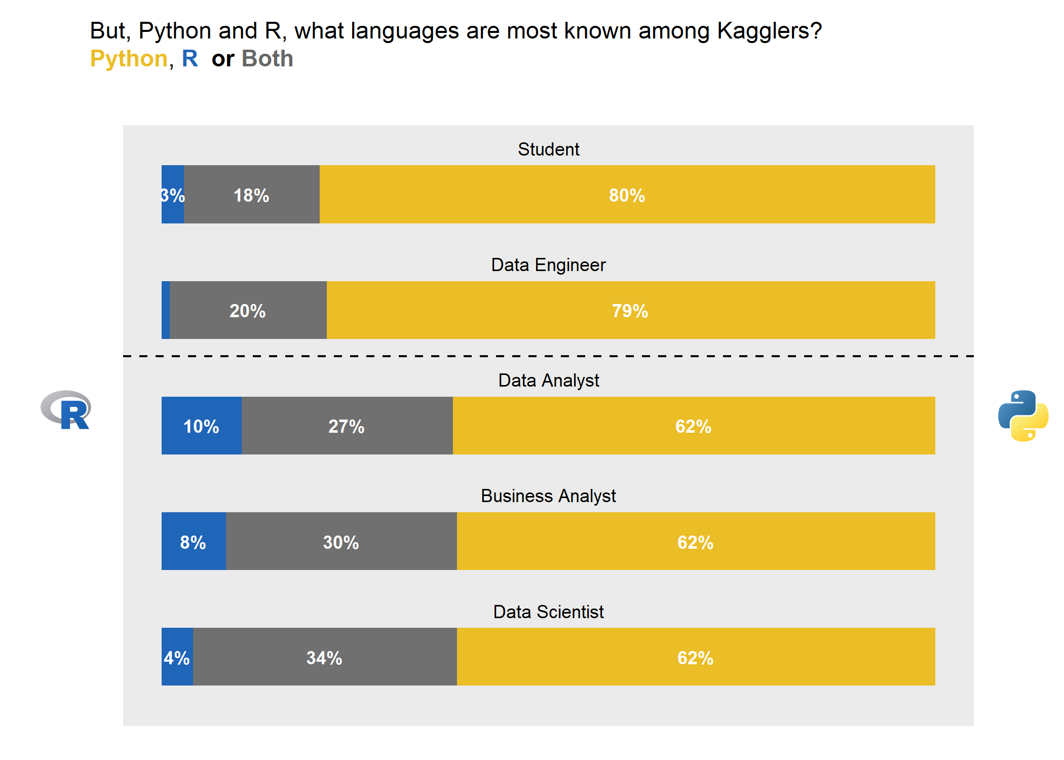
Python seems to be from the survey results the clear leader.
It is clearly thriving in students population where 80% of the surveyed persons only know Python.
For Data Engineer it is as well the preferred language where 79% of the surveyed engineers know only Python.
R is more in use when looking at people active in the “decision industry”. I am here referring to Data Scientist, Data and Business Analyst. While Python is still the main language for most, R or a combination of R and python is in average used by 4 out of 10 persons.
The number of respondents that only go by with R is quite low and top to a maximum of 10% (Data Analysts).
You’ve got skills. How hot are they? What to consider next?
A.Hot Areas
As a reminder, onward data will only be limited to 4 roles specified earlier.
One of the focus of the survey was to understand which areas and technologies the respondents had a good grasp on and which new ones they would like to acquire with the next 2 years.
Before diving into the specific technology, we will try to understand in which specific areas participants :
- currently have their skills in (left facet of the below graph)
- have the desire to gain new skills within the next 2 years (central facet of below graph)
- will have skills in in 2022. This taking in consideration current skills & new skills/tech they would like to acquire/master (right facet).
Element to keep in mind here is that participants could pick as many skills as they wanted. Hence while one single tech might come up as prevalent later in the analysis, the area itself might not be as prevalent due to fact that only one tech has been selected in the area.
And opposite is true, when one area might come up as strong (ie.Data Bases) due to multiple picks in this area by many participant - it might be that no single tech will be as “prevalent”.
# Data Preparation - population scope
surveyed_focus <- surveyed%>%
  filter(Role %in% profile_focus)

n_participant <- surveyed_focus %>%
  count() %>%
  pull(1)
focus_questions <- "Q31_|Q26_|Q27|Q28|Q29|Q33|Q35"
question_category_table <- survey_raw %>%
select(matches(focus_questions)) %>%
head(1) %>%
pivot_longer(everything()) %>%
mutate(name=substr(name,1,3)) %>%
separate(value,into = c("Q","del","del2"),sep = " - ") %>%
select(-contains("del")) %>%
distinct() %>%
mutate(area=case_when(name=="Q26"~"Cloud Platform",
name=="Q27"~"Cloud Compute",
name=="Q28"~"Cloud ML",
name=="Q29"~"DB",
name=="Q31"~"BI",
name=="Q33"~"AutoML",
name=="Q35"~"MLOps")) %>%
select(-Q) %>%
distinct()
prepped_answers <-survey_prepped%>%
select(participant_id ,matches(focus_questions)) %>%
pivot_longer(-participant_id) %>%
filter(!is.na(value),
value!="None") %>%
#mutate(name=str_remove(name,regex("Q..\\_",TRUE))) %>%
separate(name,into=c("question","time","Q"),sep="_") %>%
select(-Q)
tech_interest <- prepped_answers %>%
left_join(surveyed_focus,
by = "participant_id") %>%
left_join(question_category_table,
by = c("question"="name")) %>%
filter(!is.na(Age),
!is.na(value),
value!="NA",
value!="No / None")All Business Data profession
make_graph_top_areas( filter_role=c("Data Scientist","Data Analyst","Business Analyst","Data Engineer"))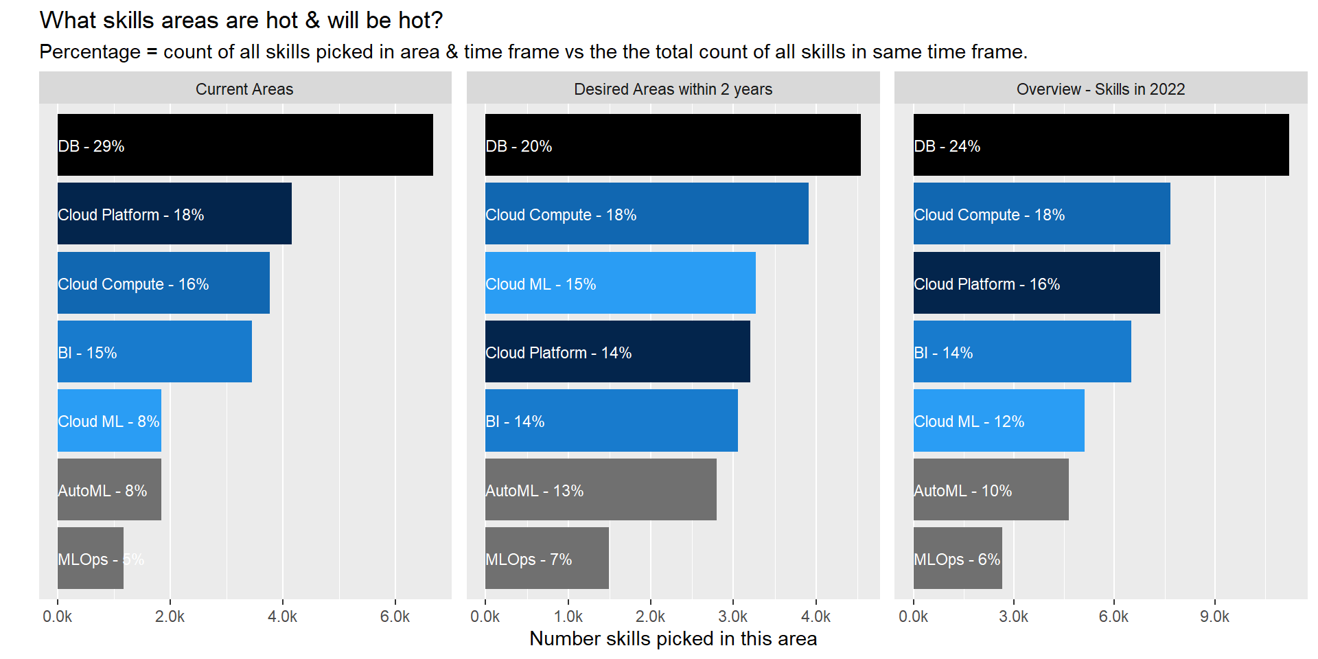
Current Areas
- 1/3 of all skills/tech currently used/known by participants relate to database. We all need to be able to connect to the data source right 😃.
- Cloud Compute services/Cloud ML product is lesser known than the cloud platform itself. I would conclude that cloud is still mainly used to store data but product within the platform are not as extensively used yet. This become more obvious when looking at next section.
Desired Areas (Next 2 years)
- There is a shift in areas of desired skills from DataBase skill to ML product and Cloud compute services though DB skills will still be the number one focus area two year from now.
- Cloud ML services will rocket through versus current status taking the 3rd spot in term of focus area.
Forecasted Overview in 2022
- As such the ranking of areas will stay pretty much the same with a slight redistribution of some of weight.
- When exploring the details for specific roles (other tabs) we can identify that this redistribution is happening in all 4 down selected roles.
- A personal surprise is the really low rank of ML Ops. It is one of the key area to ensure models are set in production and a key element to ensure success in data science. But it is not yet an area that comes through.
Data Scientist
make_graph_top_areas( filter_role="Data Scientist")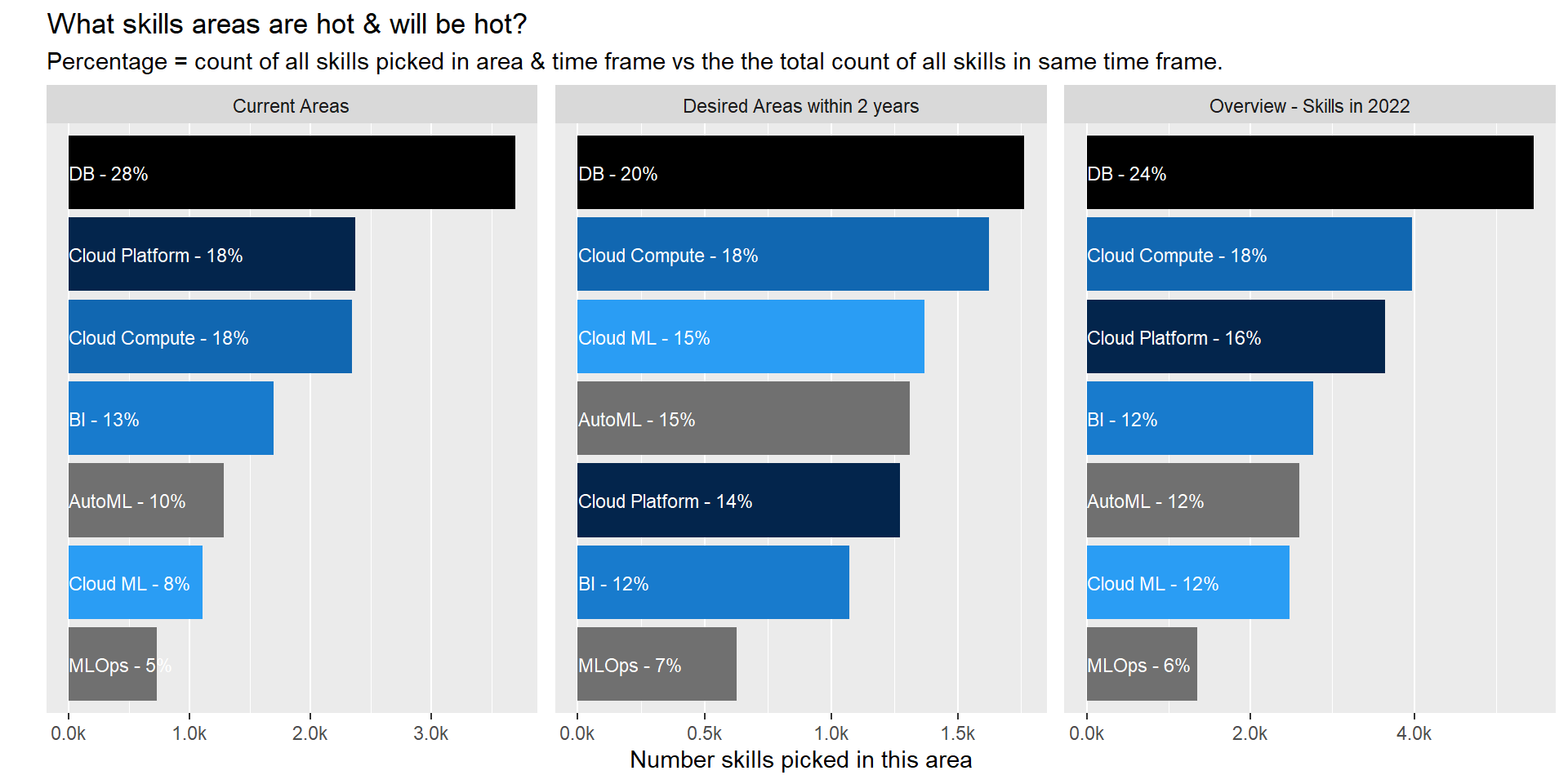
Data Analyst
make_graph_top_areas( filter_role="Data Analyst")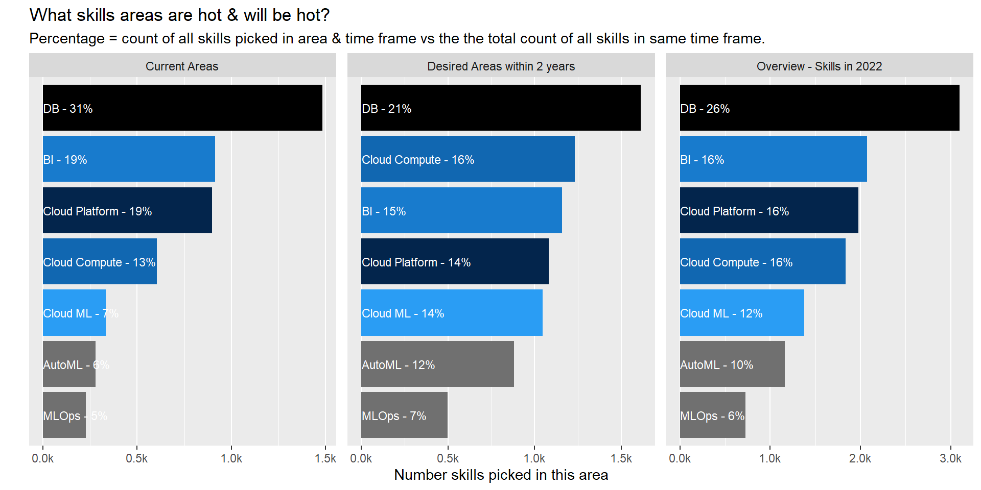
Business Analyst
make_graph_top_areas( filter_role="Business Analyst")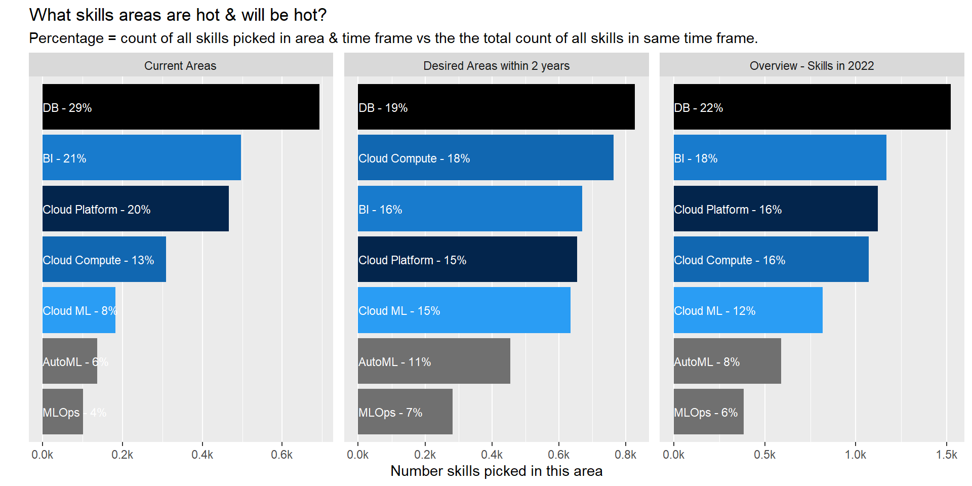
Data Engineer
make_graph_top_areas( filter_role="Data Engineer")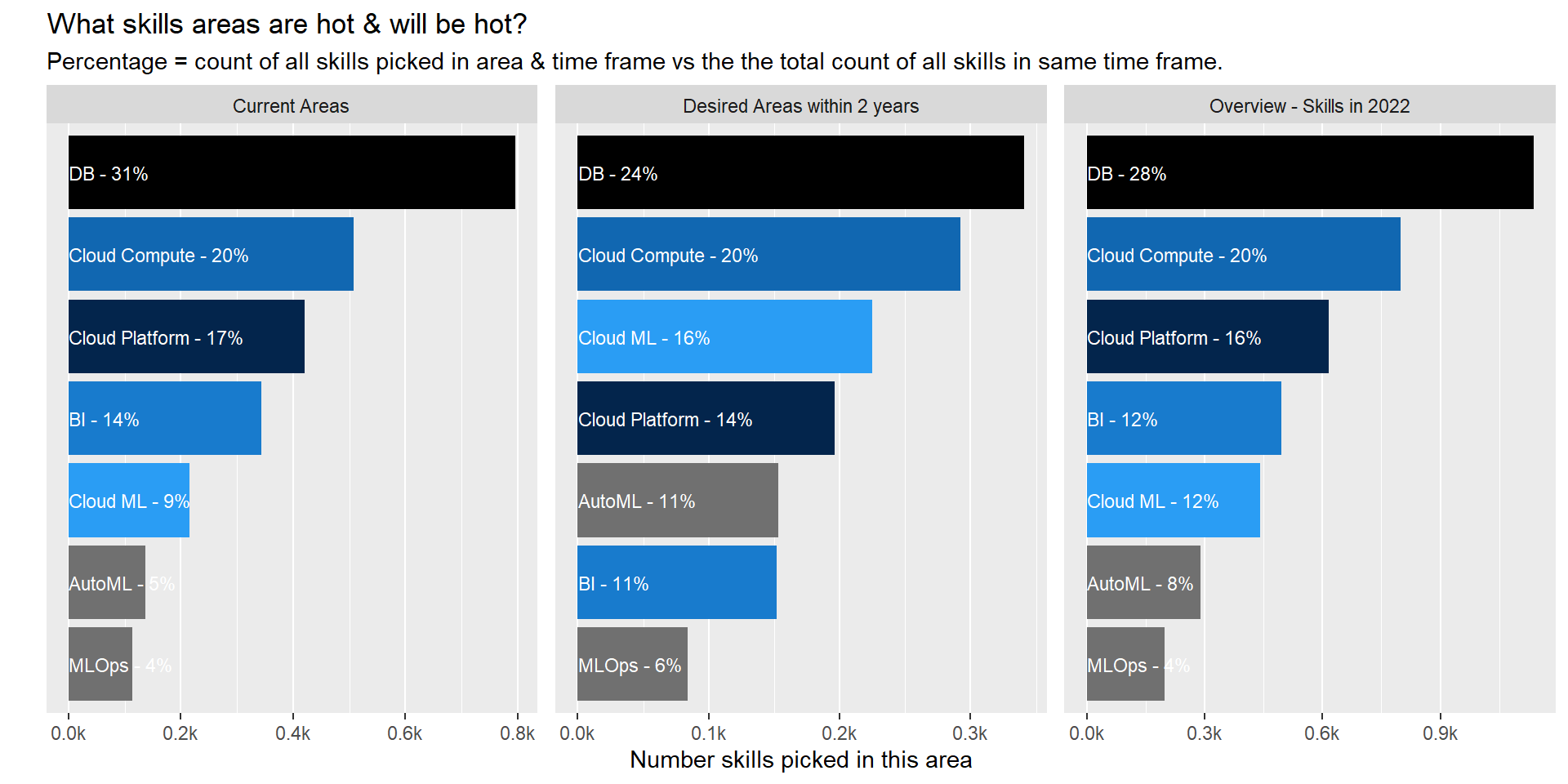
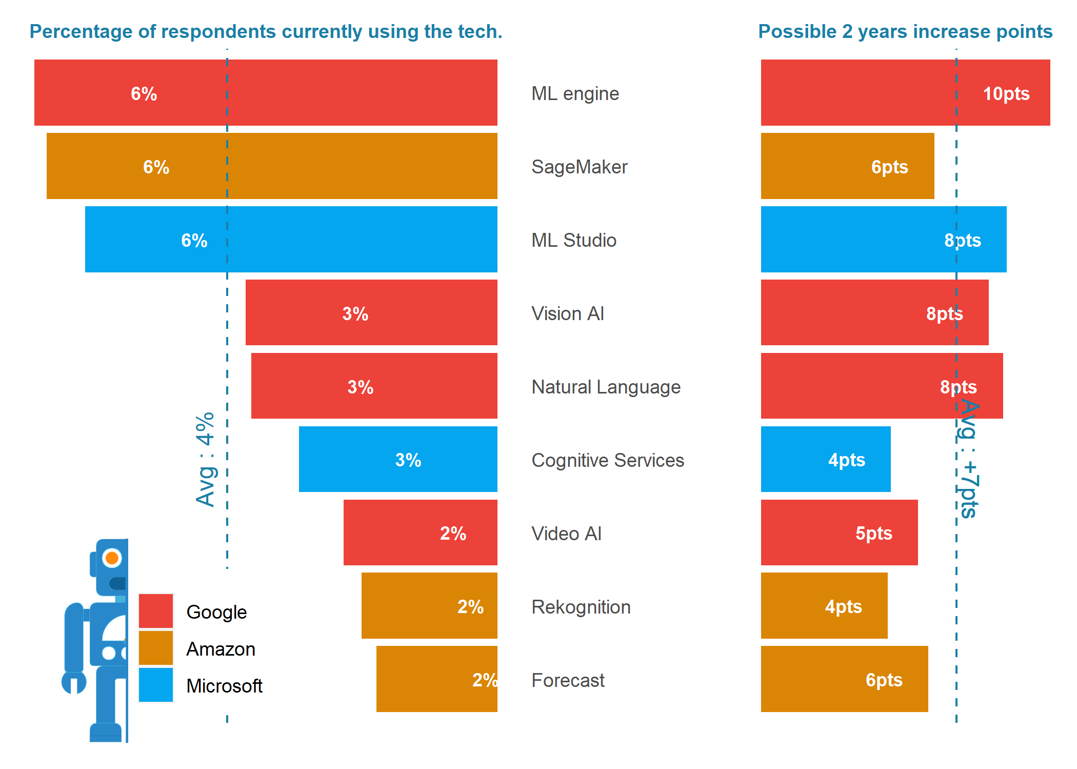
B.From Areas to specific techs
For this last section, we will :
- focus in top 4 Areas previously identified and highlight top 3 technologies (1st tab below).
- left side lollipop chart represents the percent of user currently using the tech
- right side the increase in points from user that flagged the desire to learn the tech with next 2 years
- ie. Amazon AWS : Current Utilization = 25% / Growth = +17pts / 2 years usage could reach 42%
- dive in top 5 areas to look at the current and possible future growth for each of the tech identified in the survey (2nd to 6th tab below)
Note about below Graphs : percentage represents the share of respondents using the technology on a regular basis
focus_area <- c("DB","Cloud Compute","BI","Cloud Platform","Cloud ML")
amazon <- "#db8505"
microsoft <- "#05a6f0"
google <- "#ec4239"


top_4_techno <- tech_interest %>%
  filter(area %in% focus_area) %>%
  group_by(area,value) %>%
  summarise(n_interest=n()) %>%
  mutate(interest_rank=rank(-n_interest)) %>%
  ungroup() %>%
  filter(interest_rank<4)


makers <- top_4_techno %>%
  distinct(value) %>%
  mutate(family=case_when(value %>% str_detect("Google")~ "Google",
                          value %>% str_detect("AWS|Amazon")~ "Amazon",
                          value %>% str_detect("Microsoft|Azure")~ "Microsoft",
                          TRUE~"Other") %>% as_factor())


expected_future_interest <- tech_interest %>%
  filter(time=="B") %>%
  group_by(value,area,time) %>%
  summarise(fut_interest=n()) %>%
  ungroup()


data_top_4_tech <- top_4_techno %>%
  left_join(expected_future_interest) %>%
  filter(area %in% focus_area) %>%
  right_join(top_4_techno) %>%
  left_join(makers) %>%
  left_join(top_tech_rename) %>%
  mutate(
    value_ordered = reorder_within(value_rename, n_interest, area),
    family = fct_relevel(family, "Google", "Amazon", "Microsoft", "Other")
  )


areaColors <-
  setNames( c(google, amazon, microsoft,"grey44")
            , levels(data_top_4_tech$family) )


All_techno <- tech_interest %>%
  filter(area %in% focus_area) %>%
  group_by(area,value) %>%
  summarise(n_interest=n()) %>%
  ungroup()

makers <- All_techno %>%
  distinct(value) %>%
  mutate(family=case_when(value %>% str_detect("Google")~ "Google",
                          value %>% str_detect("AWS|Amazon")~ "Amazon",
                          value %>% str_detect("Microsoft|Azure")~ "Microsoft",
                          TRUE~"Other") %>% as_factor())


data_all_tech <- All_techno %>%
  left_join(expected_future_interest) %>%
  filter(area %in% focus_area) %>%
  right_join(All_techno) %>%
  left_join(makers) %>%
  left_join(top_tech_rename) %>%
  mutate(
    value_ordered = reorder_within(value_rename, (n_interest-fut_interest), area),
    family = fct_relevel(family, "Google", "Amazon", "Microsoft", "Other")
  )

#data_all_tech %>% select(value) %>% write_csv("data_top_all_tech.csv")
Top 3 tech in top 4 areas
DB_graph <- make_top_3tech_chart(focus_area = "Cloud Platform", title_add = TRUE,X_axis_add = FALSE,height_size=1.8,icon_v = 250)
BI_graph <- make_top_3tech_chart(focus_area = "BI", title_add = FALSE,X_axis_add = FALSE)
Cloud_Prod_graph <- make_top_3tech_chart(focus_area = "DB", title_add = FALSE,X_axis_add = FALSE)
Cloud_Platform_graph <- make_top_3tech_chart(focus_area = "Cloud Compute", title_add = FALSE,X_axis_add = FALSE)
img <- c(DB_graph,BI_graph,Cloud_Prod_graph,Cloud_Platform_graph)

image_append(img,stack = TRUE)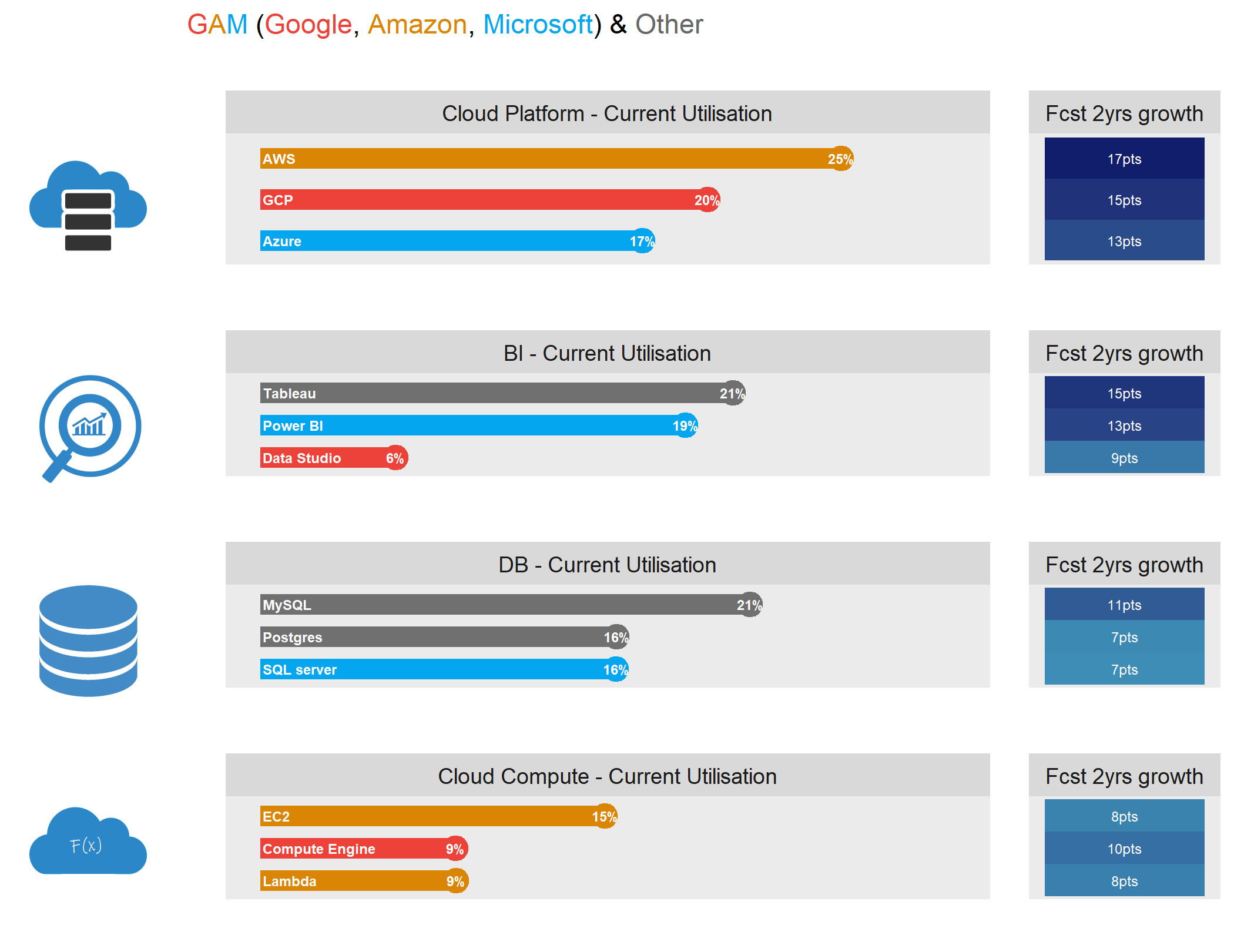
Databases
make_top_tech_by_areas(focus_area = "DB")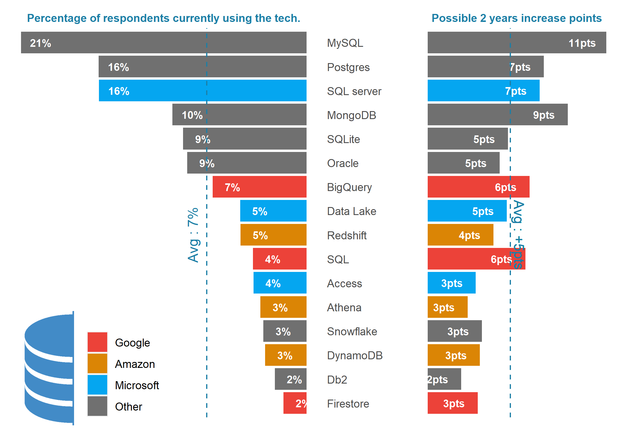
Cloud Platform
make_top_tech_by_areas(focus_area = "Cloud Platform")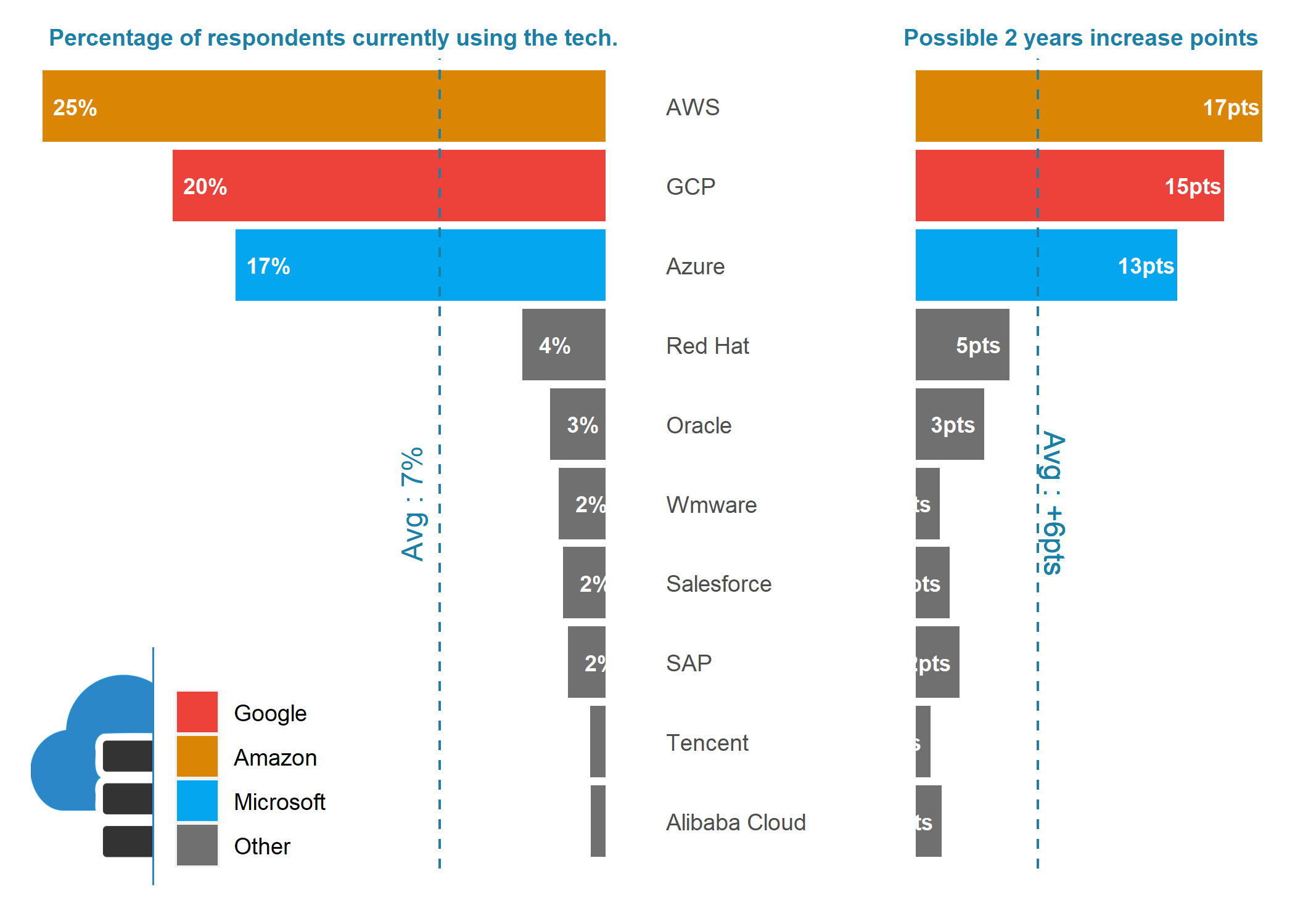
Cloud Compute Services
make_top_tech_by_areas(focus_area = "Cloud Compute")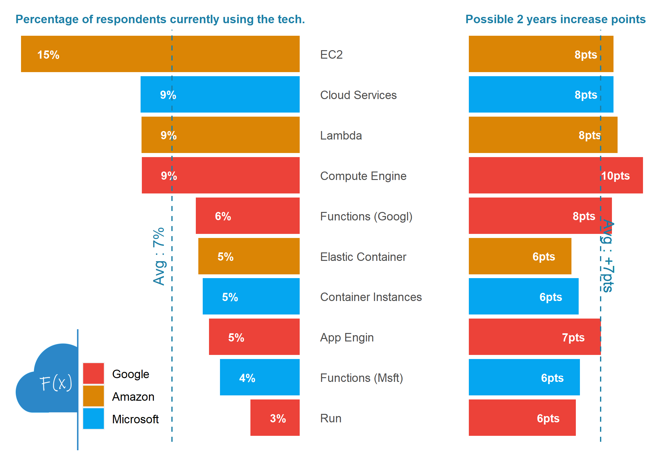
BI
make_top_tech_by_areas(focus_area = "BI")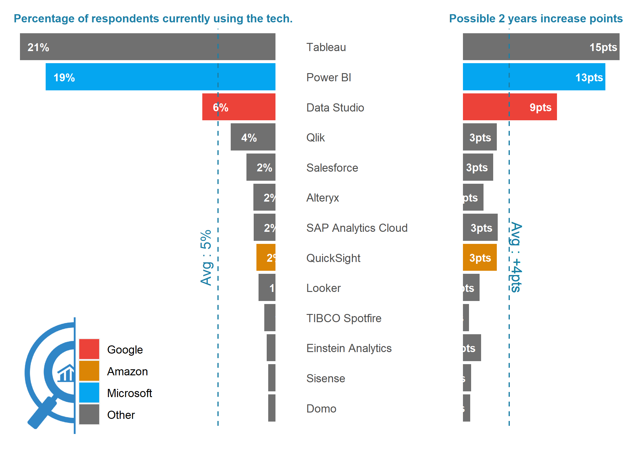
Cloud ML Services
make_top_tech_by_areas(focus_area = "Cloud ML")